
Choosing wallpaper is one of the most personal design decisions you can make — and one of the most intimidating. Unlike paint, which is easily undone, wallpaper is a commitment. The fear of making the wrong choice keeps many people in the paint aisle indefinitely.
This guide cuts through the paralysis with a practical, room-by-room framework for choosing wallpaper that works — and that you’ll still love years from now.
The Four Questions to Ask Before You Choose Anything
- What is the room’s primary function? A room for entertaining can absorb more drama than a room for rest. A home office benefits from calm. A powder room can take risks that a primary bedroom cannot.
- What mood do you want the room to create? Calm and serene? Warm and enveloping? Bold and confident? The wallpaper should serve the mood, not fight it.
- What is your existing furniture situation? Dark wood furniture reads differently against deep wallpaper than against light. Light upholstery disappears against pale wallpapers.
- What is your tolerance for commitment? If you repaint every two years, peel and stick is a better fit. If you want something permanent, invest accordingly.
Room-by-Room: What Actually Works
Living Room
The living room is typically the largest room and the most socially visible. Best choices: A textured neutral (grasscloth, linen-effect) across all four walls, or a bold botanical or mural on the main focal wall. Avoid: Very busy small-scale repeating patterns across all four walls in a large room — it creates visual noise without focal point.
Browse wallpaper options for living rooms.
Bedroom
Best choices: Textured neutrals for calming all-around coverage, or a single botanical or mural accent wall behind the bed. Avoid: High-contrast bold graphics that are visually stimulating in a room designed for rest. See our complete bedroom wallpaper guide for more.
Dining Room
Best choices: This is where you can go boldest. A dramatic mural, a deep-toned botanical in forest green or plum, or a richly colored textured wallpaper all work exceptionally well. Dining rooms are used primarily under warm artificial light, which is when deep wallpaper colors come alive. See our moody wallpaper guide for direction.
Powder Room
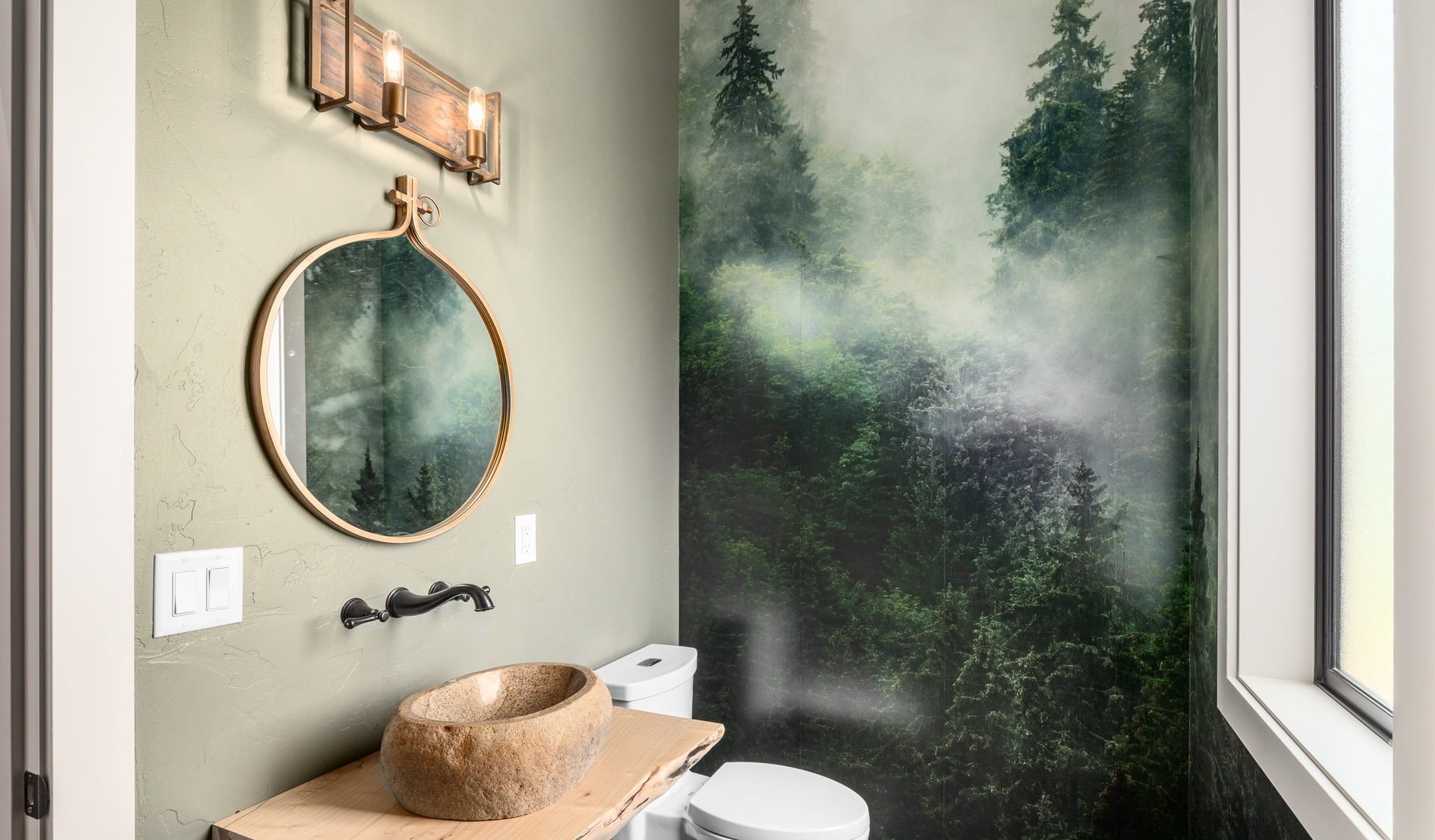
Best choices: Maximum impact, minimum commitment — powder rooms are the ideal place to take wallpaper risks. Oversized botanicals, dramatic murals, jewel-toned maximalist prints. Read our powder room wallpaper guide for specifics.
Home Office or Study
Best choices: Something that creates calm focus without distraction. A textured neutral creates warmth without visual noise. A deep, saturated tone (forest green, charcoal) on one or all walls creates a room that feels serious and considered.
Entryway and Hallways
Best choices: First impressions count, and entryways can handle dramatic choices that would overwhelm larger rooms. A rich botanical, a geometric pattern in saturated color, or a full mural on the main wall. Hallways benefit from cohesion — a single stripe or textured neutral keeps long narrow spaces from feeling fractured.
Pattern Scale: The Decision Most People Get Wrong
Pattern scale should relate to room scale — but not in the obvious direction. Small patterns in small rooms create busyness, not intimacy. Large-scale patterns in small rooms create impact and often make the space feel bigger. The rule: go larger on pattern scale than your instinct suggests, especially in smaller rooms.
Color: Practical Guidance
- Dark colors aren’t dangerous. In the right room with the right lighting, deep wallpaper colors are transformative. They read worst in rooms with little natural light and overhead-only fluorescent lighting.
- Warm neutrals photograph better than cool ones. If the room will be photographed (for listing, social media, or just personal satisfaction), warm-toned papers read better in photos than cool-toned ones.
- The room’s fixed elements anchor your palette. Floor color, existing woodwork, and natural light quality are non-negotiable. Your wallpaper must work with these — not against them.
Peel and Stick vs. Traditional Paste Wallpaper
The decision depends on commitment level and installation conditions:
- Choose peel and stick if: renting, doing accent walls only, want flexibility, are DIY-installing for the first time. Shop our peel and stick wallpaper collection.
- Choose traditional if: long-term home, full-room coverage, want maximum durability, are working with a professional installer.
If you’re working on a room in Central Washington and want a designer’s eye on your wallpaper decision, our team covers Wenatchee, Yakima, Ellensburg, Cle Elum, Suncadia, and the surrounding region. Free consultations available.
Frequently Asked Questions: How to Choose Wallpaper
How do I start choosing wallpaper for a room?
Start with four questions: What is the room’s function? What mood do you want it to create? What is your existing furniture situation? And what is your commitment tolerance? Then narrow to a style category (textured neutral, botanical, mural, bold color) before shopping specific patterns.
Should wallpaper match furniture?
No — wallpaper should respond to furniture, not match it. Pull one or two colors from the wallpaper into textiles (cushions, rugs, throws). Furniture and wallpaper should complement each other without being too coordinated, which looks like a showroom rather than a home.
How do I know if a wallpaper pattern is too busy for my room?
Order a sample and stick it on the actual wall. If the pattern dominates every glance — if you notice the wallpaper before anything else every time you enter the room — it’s too busy. A pattern that reads as part of the room’s atmosphere rather than the room’s subject is calibrated correctly.
What is the most important step in choosing wallpaper?
Sampling. Order two to three samples of your top choices and live with them on the actual wall for at least a week. View them in morning light, evening light, and under artificial light. The colors and patterns will look different in all three conditions, and you’ll make a much better decision having observed this.
How do I choose between peel and stick and traditional wallpaper?
Peel and stick is ideal for: renters, accent walls, first-time wallpaper installers, and those who want flexibility to change. Traditional paste wallpaper is better for: full-room treatments, long-term homes, high-humidity areas, and professional installations. Both categories now offer genuinely excellent products.