
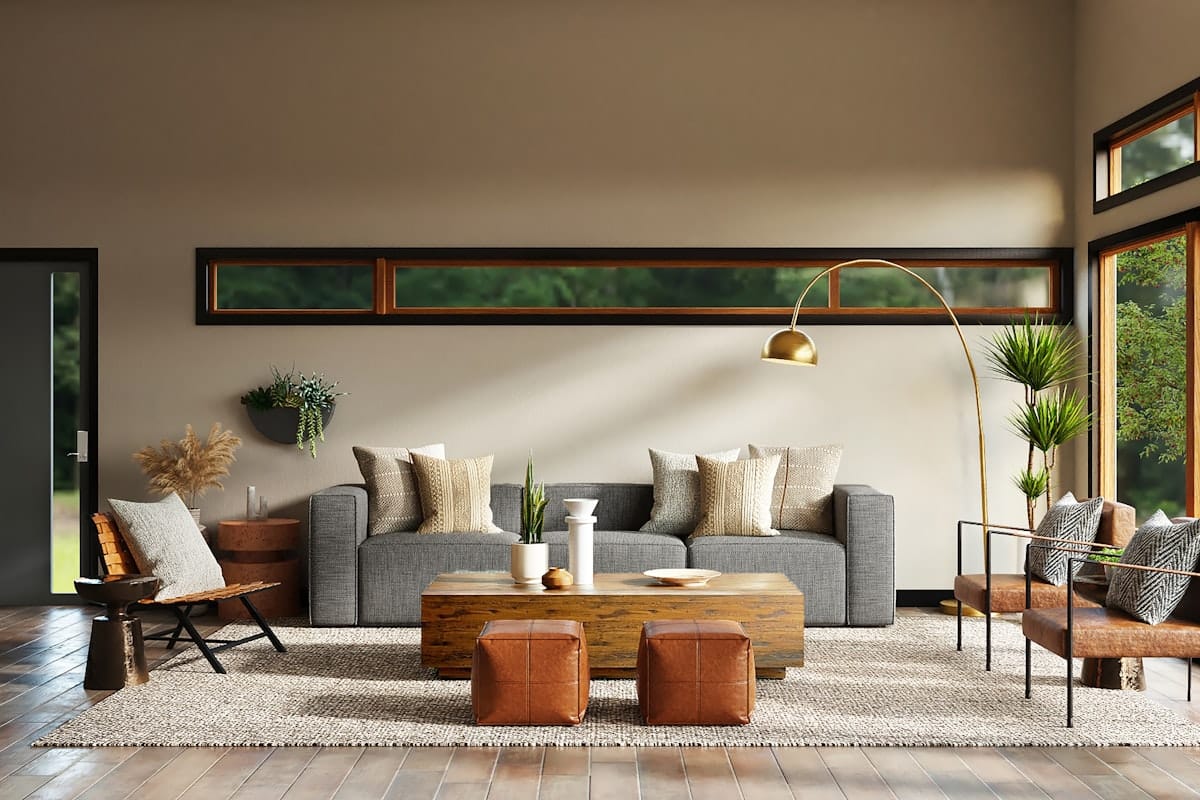
Quiet luxury has become the defining aesthetic of this design moment — but unlike most trends, it’s less about a look and more about a philosophy. At its core, quiet luxury is about quality over statement, restraint over excess, and materials that feel extraordinary without announcing themselves. It’s the opposite of fast fashion applied to interiors. And wallpaper, when chosen correctly, is one of the most powerful tools for achieving it.
What Quiet Luxury Actually Means in a Room
Quiet luxury rooms share a few consistent qualities: a neutral or deeply tonal palette, natural and tactile materials, an absence of anything that feels trendy or disposable, and a sense that every object was chosen deliberately. Nothing shouts. Everything belongs.
The colors tend toward warm whites, stone, sand, greige, camel, and deep charcoal — never anything bright or high-contrast. The materials are linen, wool, cashmere, leather, stone, and aged wood. The patterns, when present, are subtle — a tonal stripe, a barely-there texture, a refined botanical illustration with no background color.
Why Wallpaper Is a Quiet Luxury Signature
In quiet luxury interiors, wallpaper earns its place not through bold pattern but through texture and material quality. Grasscloth wallpaper — woven from natural fibers like jute, sisal, or seagrass — is the quintessential quiet luxury wall covering. It adds depth and warmth that no paint color can replicate, and its natural variation means no two walls look exactly alike. That imperfection is intentional, and it’s part of the appeal.
Linen-look wallpaper, embossed papers with subtle texture, and tone-on-tone prints (where the pattern and background are the same color family) all achieve a similar effect. The goal is a wall that rewards close attention — that looks richer the nearer you get — without ever screaming for it from across the room.
Quiet Luxury Wallpaper Choices by Room
In the living room, a grasscloth or linen-texture wallpaper on all four walls immediately elevates the space. Pair with natural linen sofas, aged brass hardware, and a few carefully chosen objects rather than many. In the bedroom, a tonal botanical — one where the print and background share the same muted palette — creates a sanctuary-like quality. In the dining room, a deeply tonal wallpaper in charcoal, warm navy, or aged olive makes the room feel like a private club. These are rooms that feel designed without feeling decorated.
Browse our wallpaper collection with quiet luxury in mind — look for texture, tonal palettes, and natural-material looks.
What to Avoid
Quiet luxury is undone by anything that feels mass-produced, overly bright, or obviously trendy. Avoid high-contrast patterns, anything that looks too perfectly uniform (the opposite of natural variation), and prints that reference a specific trend moment. If a pattern would look at home in a fast-fashion retail store, it’s not quiet luxury.
Frequently Asked Questions
Is quiet luxury just a trend or is it a lasting design philosophy?
The term is relatively new but the philosophy is timeless. Beautifully made, understated, natural-material interiors have always been considered the highest expression of good taste. The “quiet luxury” label will eventually be replaced by something else, but the underlying aesthetic — restraint, quality, warmth — never goes out of style.
What wallpaper colors are most associated with quiet luxury?
Warm neutrals are the foundation: off-white, linen, sand, warm greige, stone, and aged natural tones. Deep tonal colors — charcoal, warm navy, forest green, aged terracotta — work when used as a backdrop for natural materials. Avoid bright whites, pastels, and anything with high contrast.
Can I achieve quiet luxury on a budget?
Yes, with careful choices. Peel and stick grasscloth-look wallpaper is significantly less expensive than natural grasscloth but achieves a similar visual effect. Focus your budget on one or two materials that genuinely feel high quality — a good linen sofa, a real wood coffee table — and keep everything else simple.
Does quiet luxury work with color or is it always neutral?
Color is absolutely compatible with quiet luxury — the key is saturation and context. Deep, complex colors (forest green, aged terracotta, warm navy) work beautifully. Bright, high-saturation colors do not. Think of the colors as complex and almost historical rather than fresh and vivid.
Designing a Quiet Luxury Interior
If you’re drawn to this aesthetic and want help translating it into your specific home, our design team specializes in exactly this kind of thoughtful, material-driven interior. We work across Central Washington and can help you make choices that will feel right for years, not seasons.